Auto Extraction · Sirion · Enterprise AI

An AI can extract 128 fields. A lawyer still has to check every one.

A reviewer at her desk at night, reading a long contract. Highlighted lines in the text glow and connect to small cards floating above it, each holding a value taken from the contract.

In shortWhat this case study is about

A legal team reviews contracts every day, some of them hundreds of pages long. The details that matter, like parties, dates and notice periods, sit deep inside the paragraphs.

AI changed the first half of that job. It reads the contract and brings those values up front in seconds.

But a reviewer can’t sign off on a value just because the AI found it. She has to see the exact words. The old screen showed the answer and left her to hunt for the source.

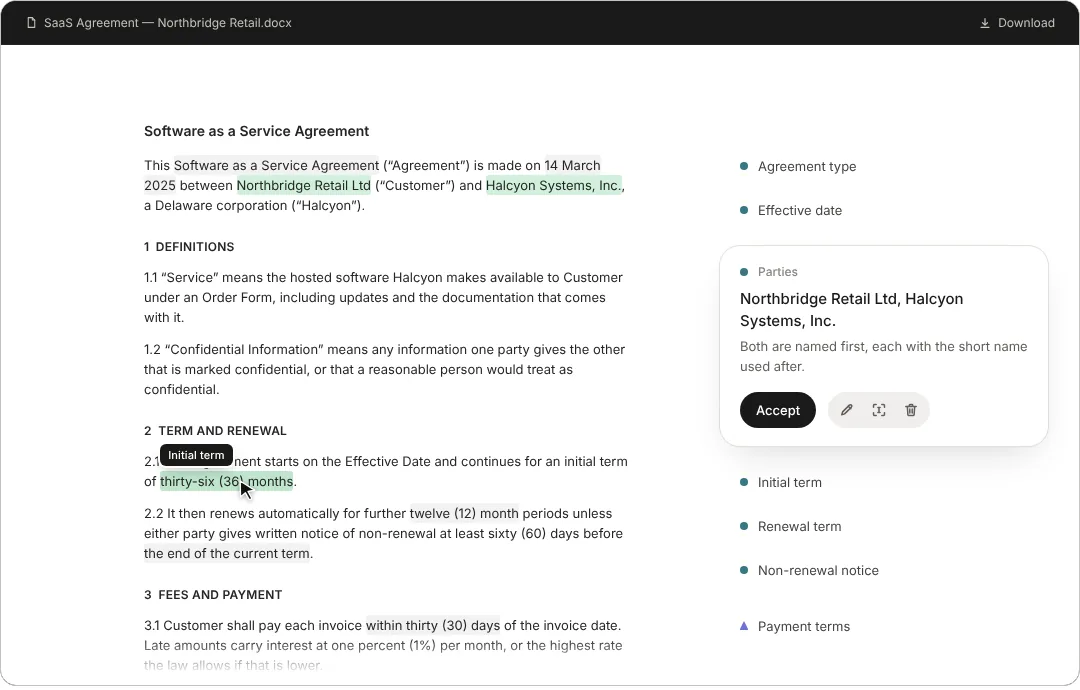
So the design work was to bring the document back into the review. One click on a value scrolls the contract to the sentence it came from. She reads it, accepts or corrects it, and the next value comes to her.

Before and after
Before, for every value she searched the contract herself, read around it, and came back to accept or fix it. Now one click takes her to the sentence, she decides, and the next value opens on its own.
When the AI is wrong
The model sometimes picks the wrong words or points to the wrong place. She can re-tag the right text in one step, and if the link to the passage fails, a fallback still shows the extracted text, so she is never stuck.
How I worked with AI
In 2024 I tested this with a Figma prototype. Today I build working prototypes in HTML with AI tools, so people react to the real thing. The review loop further down this page is one of them.

AI made the review faster. The design made it something a reviewer could trust.

The full story: how each step was designed

AI can read a contract and extract names, dates, clauses, and obligations in seconds. But someone still has to check whether those answers are right. At Sirion, I worked on redesigning the experience legal teams used to do that. The existing interface showed what the AI had found, but made it difficult to check, correct, and finish the review. My job was to make that part easier.

My role

Led the design work, from exploring the problem and designing interactions to prototyping, testing with users, and working with product and engineering

Team

Product, engineering, AI, and legal subject-matter experts

Period

August 2024 – January 2025

The problem

The interface showed the answers. Reviewers still had to find the evidence.

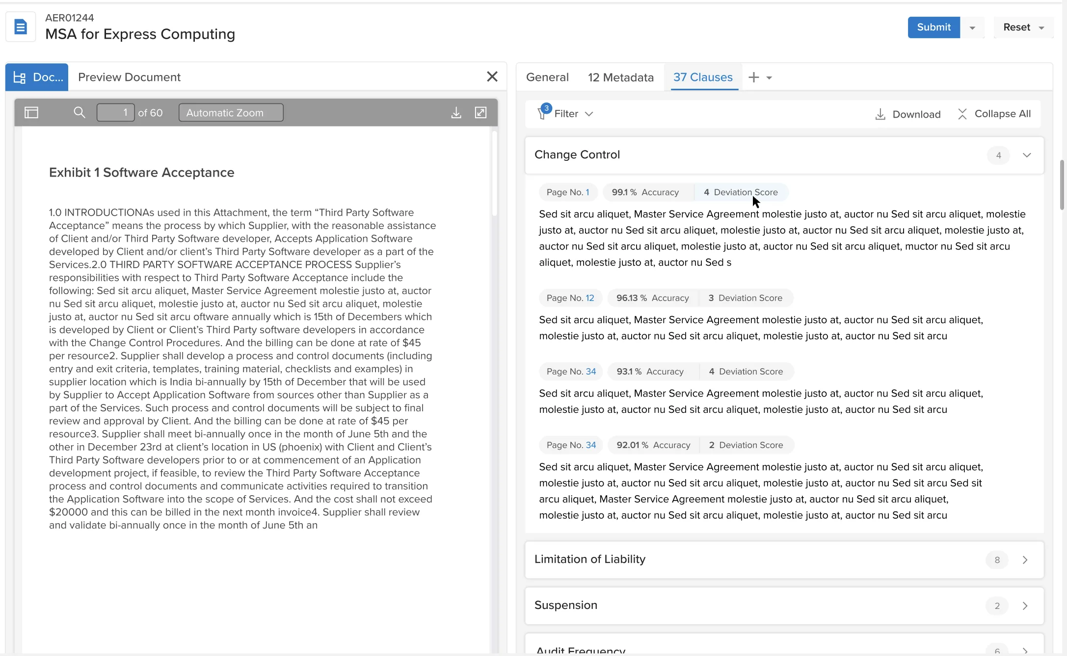
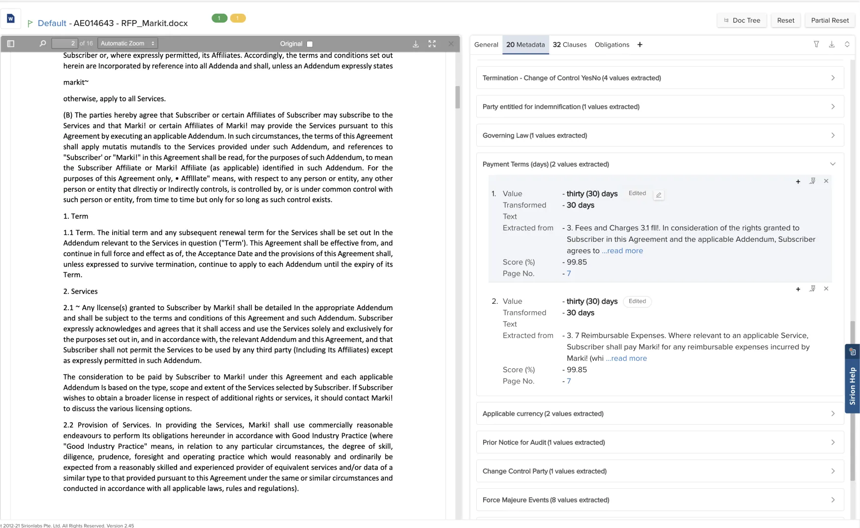
The existing screen had a contract on one side and extracted information on the other. There were labels, values, highlights, and technical AI scores. Some information appeared in more than one place.

It looked like the system had done a lot of work. But when someone needed to check an extracted value, they often had to search through the contract themselves.

The older Auto Extraction screen, Clauses tab: the contract on the left, and on the right a list of extracted clauses, each with a page number, an accuracy percentage and a deviation score.
Fig. 01 · The older screen, clauses Contract on one side, extracted information on the other. Every value carries an accuracy percentage and a deviation score.
The older Auto Extraction screen, Metadata tab: a payment terms field expanded to show two extracted values, each with the value, the transformed text, the passage it was extracted from, a score percentage and a page number.
Fig. 02 · The older screen, metadata The extracted text is repeated inside the panel, with a score beside it.

Take a termination date. The AI might show a date in the panel. But the reviewer still needs to read the clause it came from. Is it the termination date or the notice period? Are there exceptions? Does another clause change its meaning?

Customer complaints and feedback from internal users pointed to the same issue. The screen wasn't helping enough with the actual review. We wanted to improve adoption and reduce manual effort, but making extraction faster wouldn't solve everything if checking the results remained difficult.

I began with a different question:

How can we make it easier to check what the AI has found?

What I discovered

Reviewers relied on the original contract to check whether an extracted value was correct.

Legal reviewers don't judge an extracted value on its own. They read the surrounding text to understand what it means. A party name in the opening paragraph of an agreement may be straightforward. The same name appearing deep inside another clause might refer to something different. The location and context help them decide.

The old interface didn't support this particularly well. It presented the extracted value, but reviewers still had to work to connect it to the source. It also showed model scores that made sense to the AI team but weren't especially useful for making a legal decision.

During the project, I discussed the new design direction with legal subject-matter experts and had an opportunity to speak informally with members of IBM's legal team. These conversations, along with reviewing the existing experience, helped shape the direction.

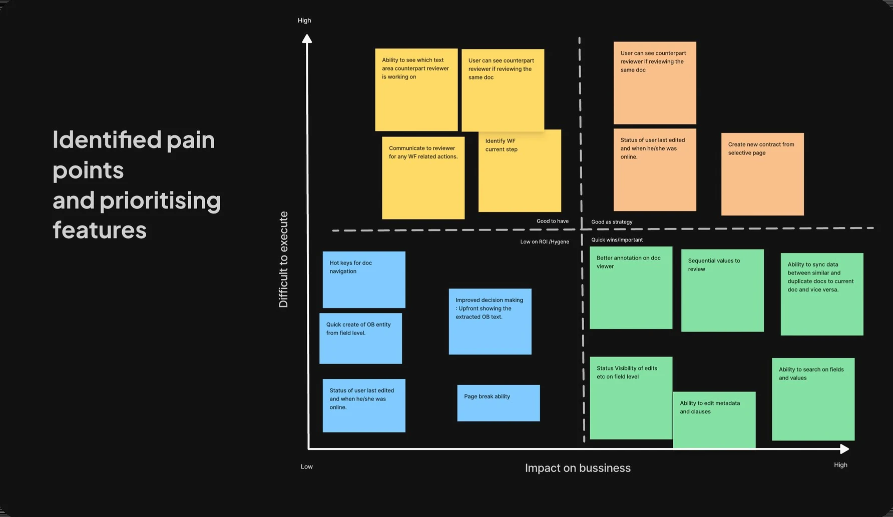
A two-by-two prioritisation board mapping pain points against business impact and difficulty to execute, covered in sticky notes.
Fig. 03 · Prioritisation Pain points mapped against business impact and how hard they were to build.
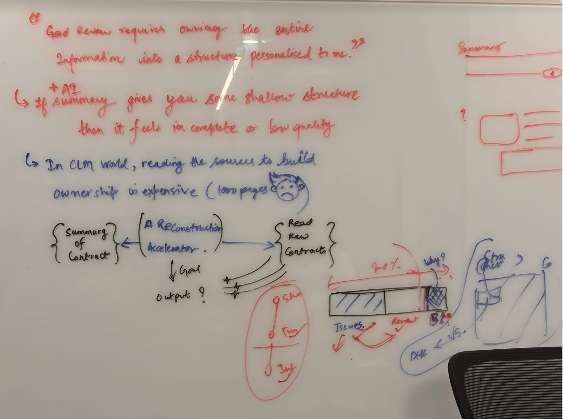
A whiteboard reading: good review requires owning the entire information into a structure personalised to me. Below it, that an AI summary giving shallow structure feels incomplete or low quality, and that in contracts reading the sources to build that ownership is expensive at a thousand pages. At the bottom, a summary of a contract and the raw contracts, with a reconstruction accelerator between them.
Fig. 04 · The whiteboard Working out why a summary on its own feels incomplete to a reviewer, and what would have to sit between the summary and the source.

I wanted three things to be easier:

Find the original text behind an extracted value.

Understand and correct what the AI proposed.

Keep track of what had been reviewed and what was still pending.

Rethinking the screen

What if we started with the document instead of the extracted data?

My first thought was to remove the right panel. Reviewers were already reading the document. Why make them move between the document and a separate list of fields?

I started exploring how the extracted information could live directly alongside the text. That led to three approaches.

01

First, inline annotations

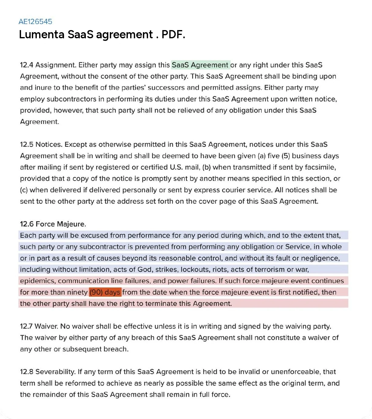
Contract text with AI-extracted values highlighted directly in the paragraphs in green, blue and red.

I highlighted extracted values in the document itself. This made it easy to see what the AI had identified. Reviewers didn't need to look somewhere else just to find a value.

But highlighting was only part of the job. People still needed to understand the extraction, make corrections, and know which items were complete.

The document alone didn't provide enough structure for that.
02

Then, hover cards

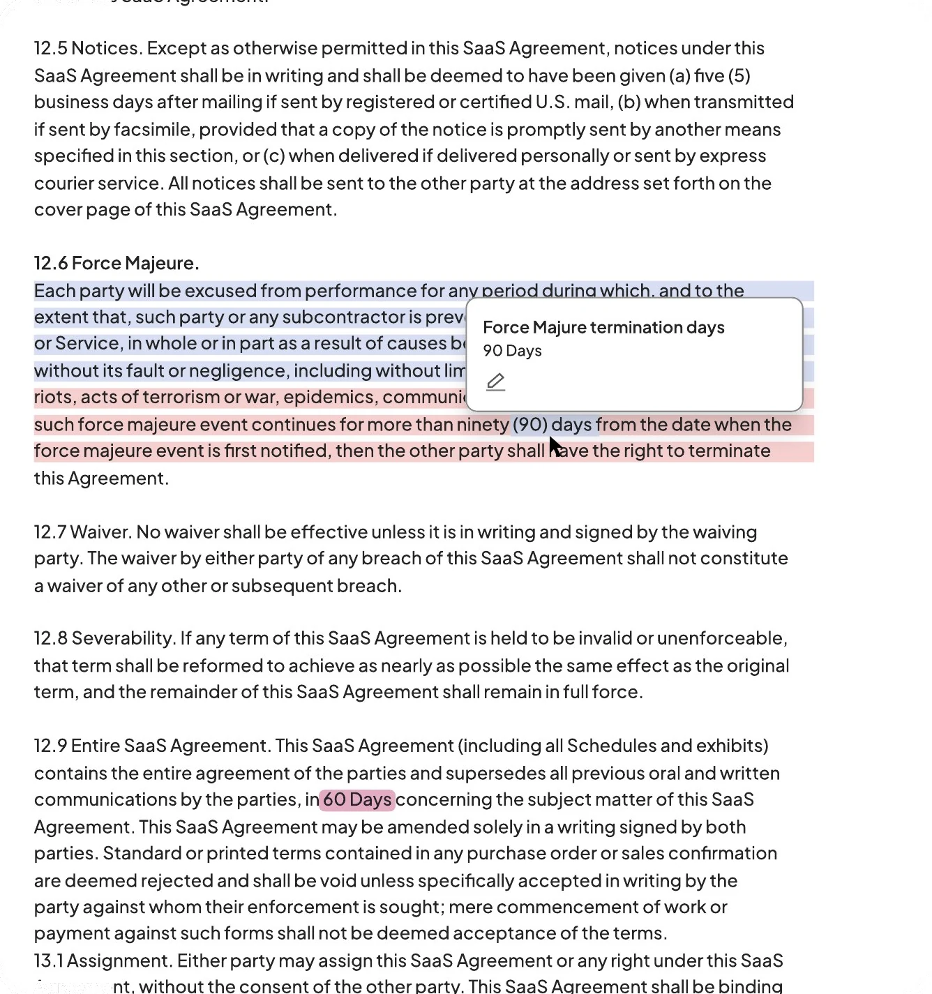
The same contract text, with a small card floating above a highlighted passage showing the extracted field name and its value.

I tried showing more details in a card when someone hovered over a highlighted value. This helped with checking a single item. The reviewer could see the extracted information without moving far from the text.

But imagine doing that across 128 fields.

Every value required another interaction. It was fine for occasional checks, but less suitable for reviewing a whole agreement.
03

Finally, assist bars

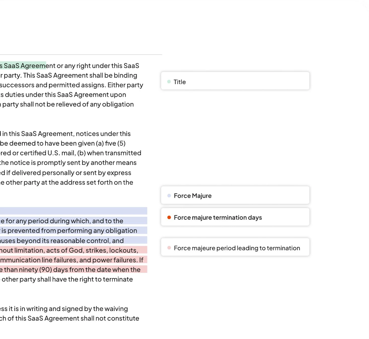
Contract text with labelled bars aligned in the right margin, each naming an extracted field beside the passage it came from.

I moved the field labels into the margin beside the document. They stayed visible and opened the review card when selected.

Now reviewers could see where information had been extracted, open a field, inspect the source, and record their decision.

The assist bars gave the document something the earlier approaches were missing: a way to work through the review. I kept this direction and developed the interactions around it.
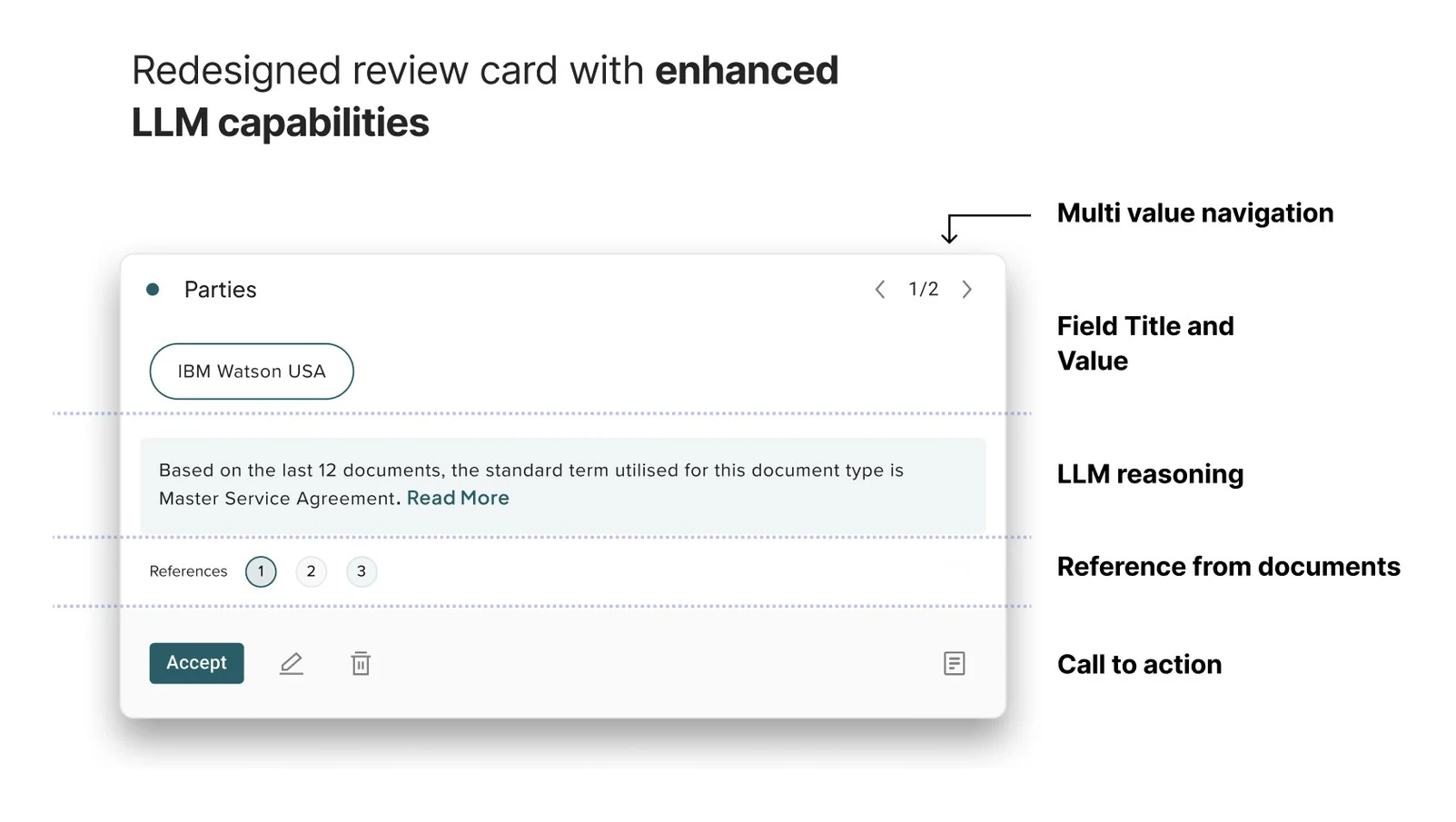
The review card broken into its parts: multi-value navigation, the field title and extracted value, the model's reasoning in plain language, numbered references back into the document, and the accept, edit and delete actions.
Fig. 05 · The review card What opens from an assist bar: the extracted value, the AI's reasoning, references into the source document, and the actions.

Making the next step easier

Once someone accepts a value, the interface confirms the action, opens the next field, and moves the document to its source. I deliberately kept the confirmation visible before advancing. I wanted reviewers to see that their decision had been recorded.

The idea was to remove repeated searching and navigation, while leaving the actual judgment with the reviewer.

Fig. 06 · The review loop Running prototype, playing a recorded sequence. Click Accept yourself and it hands over to you. The interaction is the real one. The contract and the party names are made up. Open it in its own tab →

What testing changed

One value at a time worked for reviewing. Not for everything.

I tested the Figma prototype with approximately four to five participants, asking them to use the interface and speak aloud as they worked. I wanted to see how they moved between values, inspected the document, and responded to the one-card-at-a-time approach.

I had made that approach deliberate. During a detailed review, I wanted the current value and its evidence to be the main focus. After making a decision, the reviewer could move to the next item. Participants doing detailed review were comfortable with this.

Some participants, though, wanted to scan all the extracted information before reviewing individual values. They found the sequential interaction restrictive when they were simply trying to understand what was there.

I had been treating scanning and reviewing as if they were the same task. They weren't. So I kept the sequential flow for detailed review and added a separate preview where people could see extracted information together. The preview made it easier to look across the contract. The review cards remained the place for checking individual values. Both approaches became part of the shipped experience.

A review doesn't always finish in one sitting

A contract might contain 128 fields, or even more. During onboarding and detailed audits, someone might need to come back several times to finish the work. I introduced review progress so people could see what was complete and what still needed attention.

This wasn't something we had measured as a user problem. It was a design decision based on the size and nature of the task. The progress controls were included in the released product.

Working through the difficult parts

What happens when the AI points to the wrong place?

The new experience depended on connecting an extracted value to the right passage in the document. But that connection wasn't always reliable. Sometimes the system had incorrect document coordinates. A reviewer could select a value and land on the wrong passage, or somewhere without a useful highlight.

The PM wanted to retain repeated extracted text in the panel so the reviewer could still read it when document navigation failed. It was a reasonable concern. My worry was that we would end up designing the normal experience around something that was going wrong. We had already seen how duplicated information made the original interface harder to understand.

I proposed keeping document navigation as the primary experience and giving reviewers another way to retrieve the exact text when positioning failed. That way, the fallback was available when needed without taking over the interface. We eventually agreed on this as an interim direction while engineering worked on improving positioning.

It was a useful lesson in balancing what we wanted the experience to be with what the technology could reliably support at the time.

Letting people correct the AI

What if the AI found the wrong value? Or associated it with the wrong passage? The reviewer needed more than an Accept button.

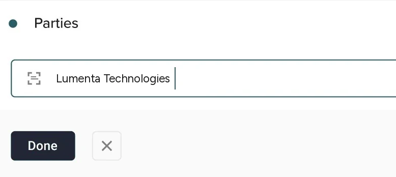
The design supported accepting a correct value, editing an incorrect one, or re-tagging the source when the wrong text had been selected. I wanted correcting an AI result to feel like a normal part of reviewing, not like something had gone unusually wrong.

A party value being corrected in place: an editable field reading Lumenta Technologies with done and cancel controls beneath it.
Fig. 07 · Editing in place Correcting a value on the card, next to the passage it came from.

Keeping larger reviews manageable

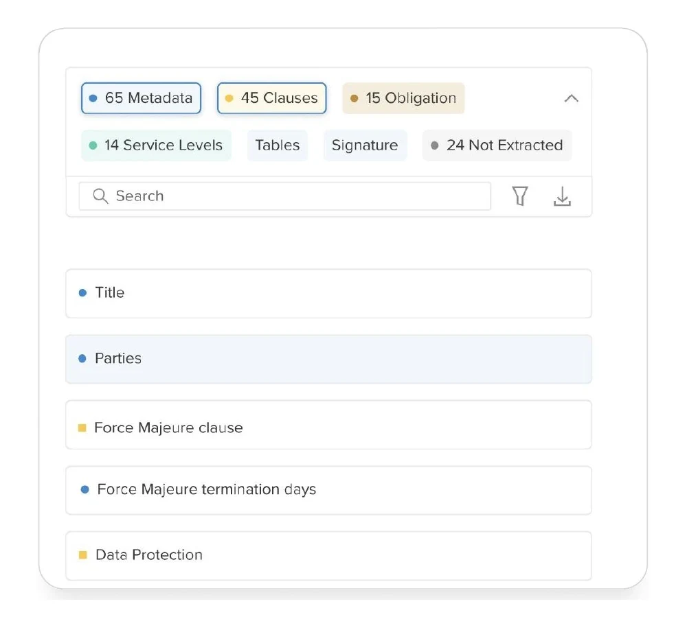
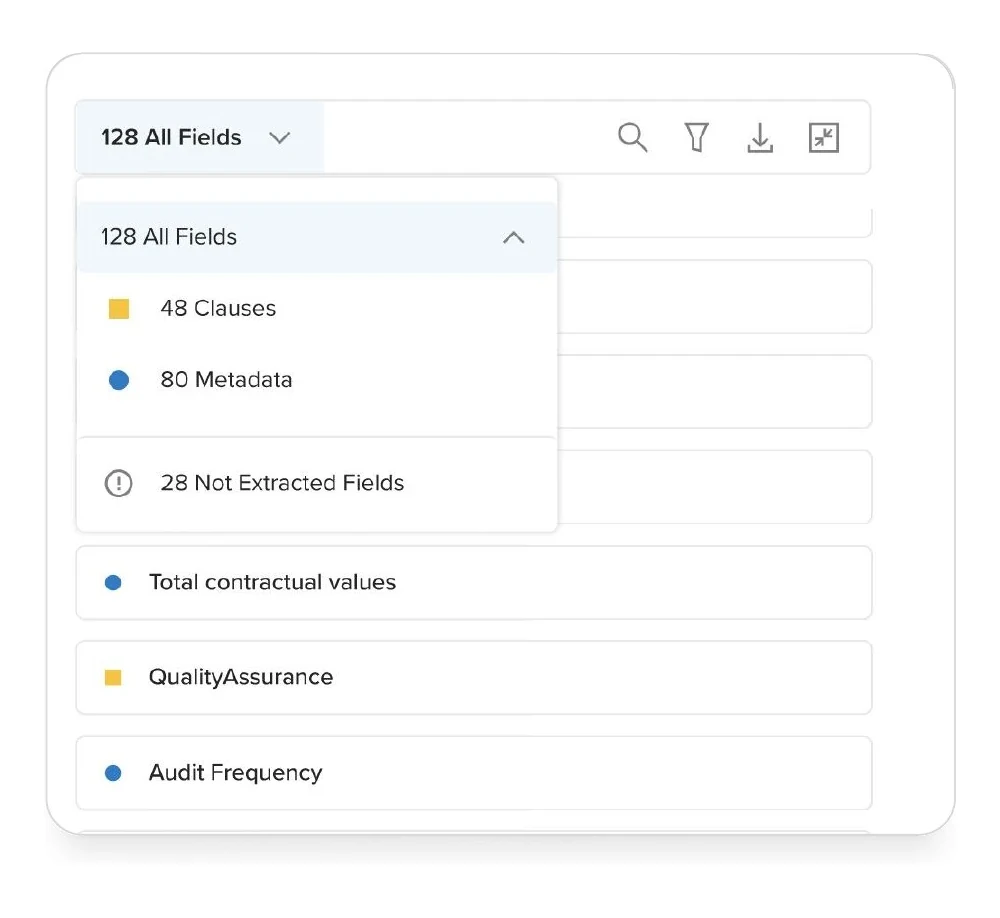
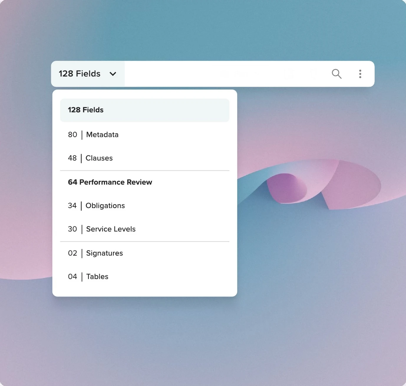
With more extracted fields, finding a particular item also became harder. I compared visible filter chips with a grouped dropdown.

Option 1

Filter chips

A filter row of coloured chips showing counts for metadata, clauses, obligations, service levels and other categories.
  • Made categories easy to see
  • Became crowded as the number of fields and categories grew

Option 2

Grouped dropdown

A dropdown filter listing extraction categories with counts, expanded over the field list.
  • Took less space
  • Could organise fields into groups
  • Required an extra click

I chose the grouped approach because it worked better with larger sets of information.

The final filter: a dropdown with fields grouped into named categories and counts, nested under a performance review heading.
Fig. 08 · The grouped filter Fields organised into groups, with counts.

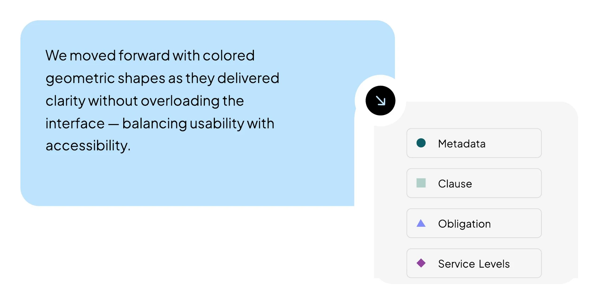
I also paired colour with different shapes to help people distinguish metadata, clauses, obligations, and service levels without relying on colour alone.

A legend showing four extraction types, each with a distinct coloured geometric shape: metadata, clause, obligation and service levels.
Fig. 09 · The four types Each type has a shape as well as a colour.

These were smaller decisions, but they mattered in a tool people would use repeatedly.

What happened after release

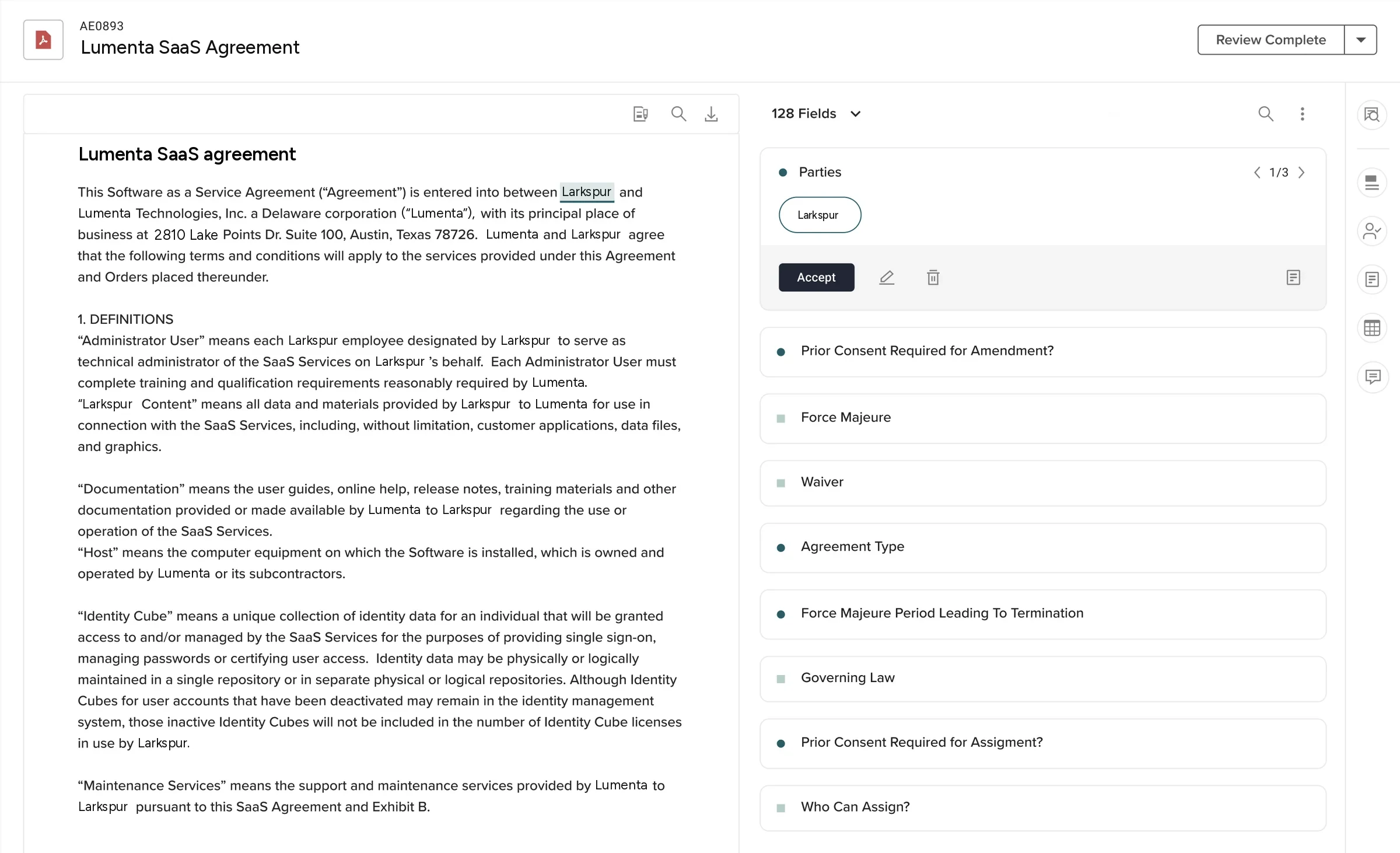
The first phase shipped with assist bars, sequential review, preview, review-progress controls, source references, and actions to accept, edit, and re-tag extracted values.

The redesigned Auto Extraction review screen: contract text on the left, a panel of extracted fields on the right with accept and edit controls.
Fig. 10 · The shipped screen Contract on the left, extracted fields on the right, with the actions on each.

The business wanted better adoption, less manual review effort, and more sustained use of the module. We didn't measure everything we should have. In particular, we didn't compare review completion time or verification accuracy before and after the redesign.

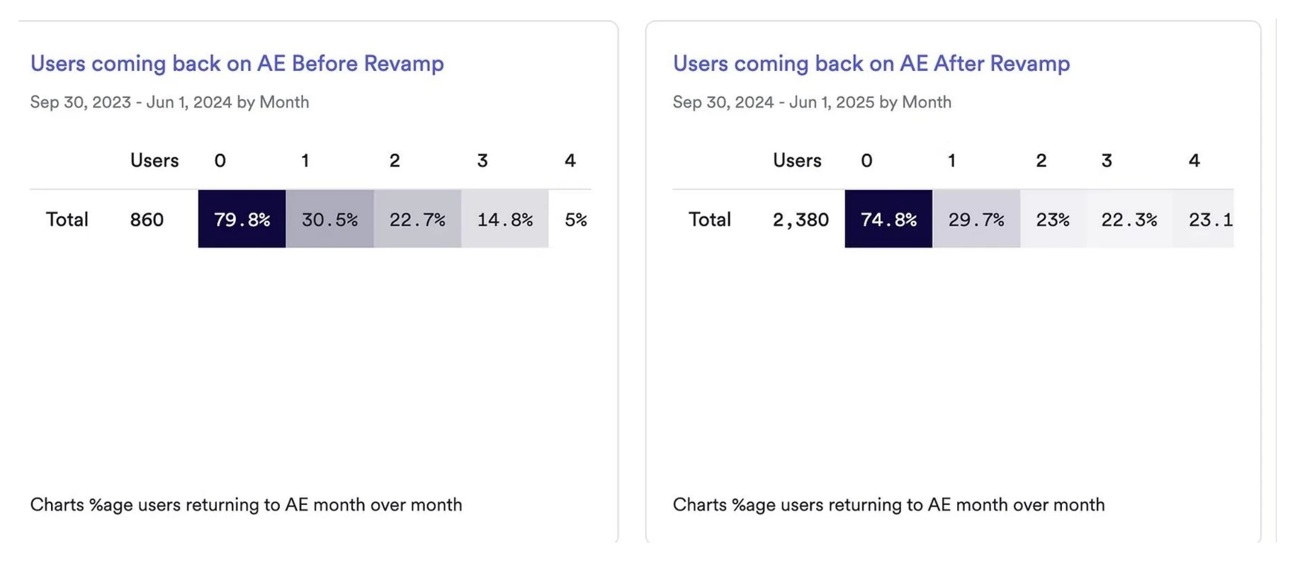
But we did have retention data from Heap. At month four, retention was 5.0% in an earlier cohort and 23.1% in a later cohort.

5.0%

Month-four retention, earlier cohort
Sep 2023 to Jun 2024, 860 users

23.1%

Month-four retention, later cohort
Sep 2024 to Jun 2025, 2,380 users

+18.1

Percentage points between the two cohorts
A signal, not proof. See below

CohortUsers Month 01234
Earlier, Sep 2023 to Jun 2024 86079.8%30.5%22.7%14.8%5%
Later, Sep 2024 to Jun 2025 2,38074.8%29.7%23%22.3%23.1%
Change +1,520-5.0-0.8+0.3+7.5+18.1
Two analytics tables from Heap showing month-over-month return rates for the module before and after the revamp.
Fig. 11 · The Heap data Users coming back to the module each month, for the earlier and the later cohort, with the cohort definitions as captured. 16 June 2025.

That difference was encouraging. It doesn't mean the redesign alone caused it. The two groups contained different users, the customer mix had changed, and the AI model had also improved during that period. So I treat the retention difference as a positive signal, rather than proof of the design's impact.

Looking back, I would have liked to measure how long people spent checking each field, how often they corrected an extraction, and how successfully they completed a review. Those measures would have told us more directly whether the experience was improving the work we set out to support.

What I learned

This project taught me a few things that I still use in my work.

01

Start with what people are trying to decide.

We began with a screen organised around what the AI produced. Things became clearer when I focused on what the reviewer actually needed to do with that information.

02

Don't confuse different tasks just because they happen on the same page.

I initially designed for focused review. Testing showed me that people also needed to scan and understand the whole document. Supporting both made more sense than forcing everyone through one interaction.

03

Technical limitations need careful design decisions.

The coordinate problem was real. So was the risk of making the interface more complicated to work around it. The answer was to provide a fallback without letting it define the whole experience.

04

Decide what to measure before the design ships.

Retention was useful to look at, but it couldn't tell us whether review had become faster or more accurate. Next time, I'd establish those measures earlier.

The biggest thing I took away was simple. The AI finding an answer is only the beginning. Someone still has to decide whether it's right. That's the part I was designing for.

Some of this is easier to talk through than to write down.

The trade-offs behind this work, and what I would measure next time, are worth a conversation.

Email me →